You may not realise it, but every action you carry out in your daily life is governed by a rarely discussed concept: affordance. Whether you are using your keyboard or even your coffee machine, your brain implicitly draws on this notion of interpretation. In this article, we look at how to factor this stage of user behaviour into your designs in order to simplify interactions with your interfaces.
This article is the result of research by Josselin, one of our consultants, who has taken a keen interest in user experience, notably alongside Sophie Viger, to whom this work is dedicated.
What is affordance?
To define the term affordance, let’s start by looking at where it comes from. It was the psychologist James J. Gibson who first used it (1977, The Theory of Affordances) to describe the actions possible between an object and an individual according to that person’s experience, context and environment. It is, in a sense, the use of an object as suggested by the object itself.
Some ten years later, Donald Norman popularised the concept with his book The Design of Everyday Things, published in 1988. In it he distinguishes between two types of affordance: perceived affordance and real affordance.
- Real affordance refers to a suggested, achievable interaction that the object was designed for.
- Perceived affordance, on the other hand, is an interaction that was not planned by the designers but is perceived by the user. It may or may not be achievable.
The door handle, or the archetype of affordance
Thanks to your experience, you are now able to open any door, and that superpower comes from your learning: the day you opened your first door, then a second, and so on. Each time it was a different handle, a different door, a different place. And yet you can recognise a door handle in almost every case, and you know how to use it. So there is something that makes us understand how to use the object every time — and that something is affordance. It is a relative concept, however, and as we said, it also depends on other factors. Let’s look at that with a second example.
The staircase, an everyday example
If you are 70 centimetres tall and you walk past a staircase with steps 50 centimetres high, chances are you will not even register that the staircase exists. You will see it as just another wall and will therefore not consider the possibility of using it to get past. The same problem arises if someone two metres tall walks past a staircase with steps 1 cm high. That person will not feel they are taking a staircase, simply that they are walking on uneven ground. In both cases — absurd, admittedly, but telling — nobody saw a staircase and so nobody set about using it as one. Which was nonetheless what the designers intended. It is therefore essential to take everyone’s different behaviours into account, in order to find a middle ground on step height and so come as close as possible to a level of affordance that works for everybody.
Affordance, an element to take into account in design
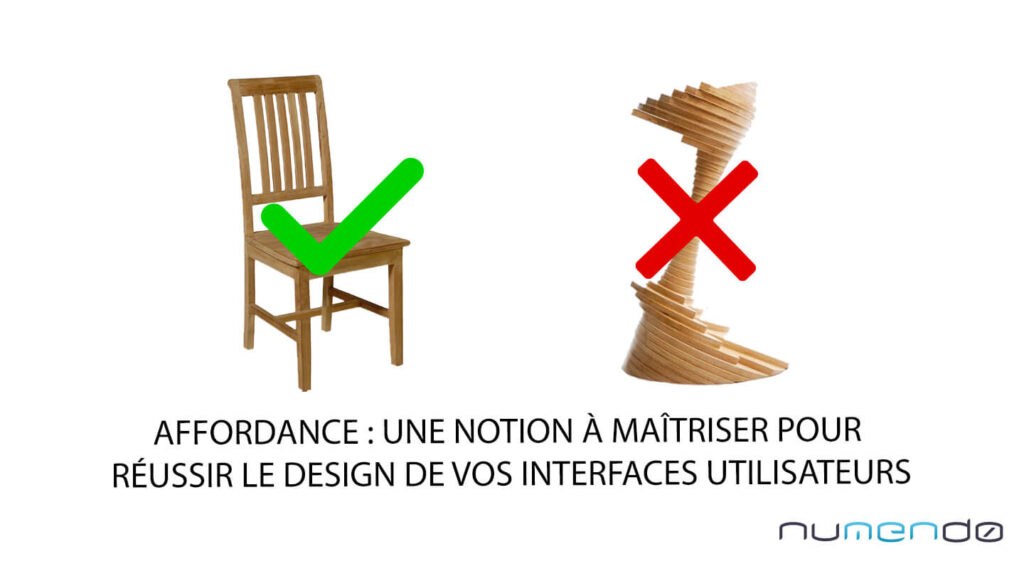
If your company makes chairs, it will probably use a design close to the other chairs that have always been produced, and reuse the affordance specific to that type of product.
If, on the other hand, you innovate a little too much, you may end up with a product that communicates its purpose poorly. In that case we have lost perceived affordance.
The same applies to web design and mobile app design. When we design user interfaces, we take care to represent elements such as buttons, forms and even links in a way that is more or less similar to what is already done in the field. Why? Because it is necessary to draw on the experience users have already acquired. That makes the possible interactions easier to understand and therefore optimises the user experience.
Drawing on users’ experience with signifiers
Affordance is often in the service of action, and one widespread use case is the “call to action”. For an online retail site, the objective is very often to guide the user towards adding products to the basket and then towards completing the order. That journey is highlighted by means of calls to action. It is about foregrounding a possible interaction with an interface by representing it in a pronounced and explicit way.
This “add to basket” button is familiar to us because we come across it everywhere, and there are often similarities between one site and another. These similarities are called signifiers. They are a set of characteristics possessed by the element that remind us of its equivalent on the other interfaces we have dealt with before. In our case, they often include bright colours, positioning on the right-hand side of the page and sometimes a sense of depth.
That is what allows us to understand what the button is for, even if we change the text content, for example:
Media to re-attach: the button examples illustrated in the French article were lost during content extraction and must be re-inserted.
This makes it possible to identify the type of element (button, link, and so on) and how you can interact with it, while also allowing its display to be prioritised in order to highlight the desired content.
The importance of design: an example with flat design
Since the arrival of flat design it has been difficult to keep the signifiers known up to that point. By changing the graphic style of elements, you can also strip them of certain connotations. This idea can be illustrated using the two “download” button designs below. The first, with carefully worked contrast, rounded corners and a drop shadow, gives an impression of perspective. It therefore draws on the user’s experience by illustrating the action a click performs, namely pressing a button. The second, which is much simpler, does not evoke the same interaction. As a result, it is harder to identify this element as an interactive button that you are meant to press. If flat design nonetheless works today, it is because it is an evolution of the more realistic design used previously. Once again, this form of design merely borrows the codes and signifiers of what came before.
Media to re-attach: the comparison of the two “download” buttons is missing — the images were lost during content extraction.
Suggesting an action on mobile
New persistent characteristics have to be invented so that users can continue to understand the type of element they are dealing with, and so as not to leave them disoriented. That said, not everything can be made as “affordant” as we would like. On mobile, we often come up against cases where interactive elements cannot properly describe their own use. Swiping is one example: a movement you already have to have performed in order to be able to repeat it.
Users then have to be guided so that the mechanism can be explained to them. Fortunately, mobile apps resemble one another and it is becoming easier and easier to work out how they function simply by imitation. So much so that if your app does not use interaction standards, you will quickly risk never managing to retain users, who do not expect to have to relearn everything. One way of finding the right ways to have users interact with our interfaces is testing — and A/B testing in particular lends itself perfectly to the exercise.
UX: making the interface speak for itself
Imagine your objective is to encourage exchanges between users on a social network, and that the network has a friend-adding feature as well as instant messaging. To achieve your objective, a typical user story would be to encourage the user to go to their inbox and send a message to recently added friends. To guide the user, you need to create a user journey using visual cues that prompt them to carry out a series of actions. So here we are, back to our famous calls to action.
As said earlier, it is necessary to use as many symbols as possible that echo the user’s past experience, which is why an appropriate affordance in this case would be the red dot.
By drawing the eye to the messaging button, we prompt the user to click. All that then remains is to invite them, in the next view, to write a message to another recently added user. This is the scenario Facebook has been using for several years to increase interactions within its network. The UX designer is best placed to consider affordance in the design process, and can easily measure it using certain methods. One of the simplest takes place as part of tests involving a limited group of users (live or A/B testing), presenting visuals of the app (or the app itself) to users while identifying the various target journeys beforehand.
The more the user hesitates to complete the journey, the less effective the interface is at foregrounding the intended scenario. Proposing a new design that takes into account the precise moments where the user tended to get stuck or to avoid the intended journey — by placing new eye-catching elements — gradually makes the scenario achievable for the greatest number of users.
So it is a matter of communicating as intuitively as possible the interactions we want the user to perform, by drawing, once again, on that user’s existing knowledge.
This is one method of measuring affordance, and it has the merit of remaining simple, but there are others that I invite you to discover (for example calculating the monosemic efficiency rate).
Don’t reinvent the wheel — unless no signifier allows your proposition to be interpreted
Making an object or an interface understandable is not easy. It takes time and a great deal of testing to arrive at the right design, one that comes as close as possible to the way the user expects to use the product.
You will often find that repurposing familiar interactions makes it possible to capitalise on knowledge users have already acquired. That is clearly what you should try to do first. If nothing matches known interactions, you will have to try to create a new way of manipulating the object or interface — and above all make sure that new interaction is intuitive. In every case, bear in mind that the effectiveness of your interface depends on the people who are going to use it and on their ability to understand what is expected of them. That should lead you to find the right compromise in order to reach as many people as possible, and for that there is nothing like testing as much as you can. Don’t impose your own vision: trust your users.
Feel free to read other articles on the same topic on our blog.