Do you know how patient a web user really is? Less than 3 seconds — after that, they leave the page and you have already lost half of your visitors. Now go ahead and test your site’s loading time. If it takes longer than that, this article is for you!
A web page’s loading time is one of those site performance metrics that needs to be as good as it possibly can be. However, beyond the code itself, UX designers can also help improve it. In this article, we are going to share a trick for reducing that feeling of waiting. As you will have seen in the title, we are talking about the Skeleton Screen. But first, a few words about the person who invented it.
Luke Wroblewski
Luke Wroblewski is without any doubt a passionate person. Product director at Google, previously CEO and co-founder of Polar as well as product director and co-founder at Bagcheck. A very full career indeed!
Luke Wroblewski is the author of 3 books and has published numerous articles — including the one in which the term “Skeleton Screen” was coined for the very first time.
The observation was this: conventional loading indicators draw users’ attention to the fact that they are waiting. Nobody likes waiting these days, and that is just as true on the web, which users experience as something instantaneous.
An idea was then born: change users’ perception by telling them that the content is arriving soon, rather than that it is loading. It is that perception — the feeling that the page is almost within reach, as opposed to the feeling of waiting — that changes everything!
The birth of the Skeleton Screen
It was in an article dating back to 2013 that Luke Wroblewski first mentioned the skeleton screen principle, but we can assure you it is still highly relevant today. And even now, not everybody knows what it means. Fortunately, we are here to help.
The Skeleton Screen is not a difficult concept to grasp. And we are not just going to explain it to you: we are also going to tell you why it is a smart idea to put it into practice on your website, your blog or your mobile app.
A closer look at the skeleton screen concept
The Skeleton Screen is designed to display when it detects that the page content is loading. Because a page can be asynchronous (meaning it has to wait until the content is fully loaded before it can display), it creates a kind of delay — and therefore a wait — on the user’s side.
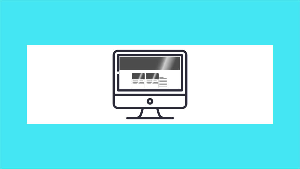
The Skeleton Screen is therefore there to tell the user that the page is loading, just like those conventional loading indicators, you might say… Well, yes! With one crucial difference: it looks visually very close to the final page the user is about to see. It therefore keeps the user waiting far more effectively, because they can anticipate the page that is going to be returned to them.
Why use this method?
So it is important to reassure users that your page is loading — but above all to convey a sense of speed!
You need to give them the feeling that loading is almost instantaneous. To do that, move away from the idea of loading and draw attention to what is about to appear. In other words, project the user into the future.
And you may already have noticed it! Major players use this method, including Google Drive, Slack, Netflix and many more.
How do you implement a Skeleton Screen?
A Skeleton Screen can be built in several ways. It can be implemented using a JavaScript library, but also with CSS alone.
First, you need to identify the content areas that are repetitive and recognisable. For example, H1 headings, H2 subheadings, images and a few lines of body copy. Next, you represent them with squares, lines, circles, rectangles — whatever you like, as long as they have the shape and occupy the space they actually take up on your page.
Finally, instead of the content, fill those shapes with a cool colour. No royal blue or fuchsia pink — rather grey, or a greyish blue for instance. Above all, make sure the two pages are visually identical in terms of layout!
What remains now is to avoid the user thinking they have landed on the final page. Indeed, if the page stays static, nothing tells them that content is loading in the background. That can be a problem for us since, remember, we are trying to keep users engaged while the page loads. Rest assured, once again there is nothing complicated about it. Animating the whole thing will be enough to signal it. A gradient animation, movement on the shapes, or a fade effect, horizontal or vertical — it is up to you to be original!
For example, with the Numendo blog:
Go for it, test it out and see the positive effects the Skeleton Screen can have on your audience.
To read more articles about UX, head to the Numendo blog, UX/UI category.
To go further in optimising page start-up loading time, we suggest watching the video about BinAST in our article A Look at the Meet Up organised by Numendo on 1 October 2019.